Shop
DreamUp AI Art
DreamUp
Join
Log In
User Menu
Upgrade to Core
Theme
Display Mature Content
Suppress AI Content
Get Help and Send Feedback
Terms of Service
Privacy Policy
Submit
Deviation
Submit your art
Upload your creations for people to see, favourite, and share.
DreamUp
Turn your dreams into reality
Generate your own AI work.
Status Update
Post an update
Tell the community what’s on your mind.
Journal
Post a journal
Share your thoughts, experiences, and stories behind the art.
Literature
Submit your writing
Upload stories, poems, character descriptions & more.
Subscription
Get your fans' support
Fund your creativity by creating subscription tiers.
herr-o on DeviantArt
https://www.deviantart.com/herr-o/art/Farscape-Aeryn-UPDATED-4727647
herr-o
Deviation Actions
Add to Favourites
Comment
5
Favourites
Tilir
Teufelseinhorn
$2.50
200
Download
More by
herr-o
Watch
herr-o on DeviantArt
https://www.deviantart.com/herr-o/art/Farscape-Crichton-5211938
herr-o
herr-o on DeviantArt
https://www.deviantart.com/herr-o/art/Crichton-and-stuff-7400677
herr-o
herr-o on DeviantArt
https://www.deviantart.com/herr-o/art/Xena-with-colors-fix-1071008
herr-o
herr-o on DeviantArt
https://www.deviantart.com/herr-o/art/Xena-Warrior-Princess-1058470
herr-o
herr-o on DeviantArt
https://www.deviantart.com/herr-o/art/Farscape-Who-s-Harvey-4668230
herr-o
herr-o on DeviantArt
https://www.deviantart.com/herr-o/art/Farscape-Crichton-LARGE-5455061
herr-o
herr-o on DeviantArt
https://www.deviantart.com/herr-o/art/Scorpy-steps-4708712
herr-o
herr-o on DeviantArt
https://www.deviantart.com/herr-o/art/Jack-Sparrow-3098814
herr-o
herr-o on DeviantArt
https://www.deviantart.com/herr-o/art/Clouds-and-girl-8033782
herr-o
Suggested Deviants
jonbromle1
Watch
jonbromle1 on DeviantArt
https://www.deviantart.com/jonbromle1/art/ST-Antares-1-7-What-Dreams-Indeed-Part-I-861442374
jonbromle1
jonbromle1 on DeviantArt
https://www.deviantart.com/jonbromle1/art/ST-Antares-1-3-The-Call-of-the-Expanse-829731777
jonbromle1
jonbromle1 on DeviantArt
https://www.deviantart.com/jonbromle1/art/STAR-TREK-SOJOURNER-Season-I-591364384
jonbromle1
Suggested Collections
Farscape
jasonpal on DeviantArt
https://www.deviantart.com/jasonpal/art/farscape-93607981
jasonpal
Mallacore on DeviantArt
https://www.deviantart.com/mallacore/art/Farscape-2021-A-876135348
Mallacore
Mallacore on DeviantArt
https://www.deviantart.com/mallacore/art/Farscape-Imprisonment-2021-877071835
Mallacore
Farscape
Lun-art on DeviantArt
http://creativecommons.org/licenses/by-nc-nd/3.0/
https://www.deviantart.com/lun-art/art/Farscape-Crichton-and-Aeryn-Sun-371735592
Lun-art
Hunter-Fett on DeviantArt
https://www.deviantart.com/hunter-fett/art/Chiana-Farscape-441935730
Hunter-Fett
Farscape-Club on DeviantArt
https://www.deviantart.com/farscape-club/art/Zhaan-23819762
Farscape-Club
Terminator
slaine69 on DeviantArt
https://www.deviantart.com/slaine69/art/Sarah-Connor-527421986
slaine69
endoftheline on DeviantArt
https://www.deviantart.com/endoftheline/art/Sarah-Connor-97602655
endoftheline
Nyu-Lilu on DeviantArt
https://www.deviantart.com/nyu-lilu/art/Sarah-Connor-356745360
Nyu-Lilu
You Might Like…
noceur on DeviantArt
https://www.deviantart.com/noceur/art/Officer-Aeryn-Sun-14255185
noceur
ChristoferRudd on DeviantArt
http://creativecommons.org/licenses/by-nc-sa/3.0/
https://www.deviantart.com/christoferrudd/art/Farscape-276770405
ChristoferRudd
shinga on DeviantArt
https://www.deviantart.com/shinga/art/Ready-To-Kill-3-35774743
shinga
roberthendrickson on DeviantArt
https://www.deviantart.com/roberthendrickson/art/Farscape-243378137
roberthendrickson
jc-starstorm on DeviantArt
https://www.deviantart.com/jc-starstorm/art/Sci-Fi-Shotgun-666853645
jc-starstorm
MonicaHooda on DeviantArt
https://www.deviantart.com/monicahooda/art/Vasquez-266514033
MonicaHooda
jonbromle1 on DeviantArt
https://www.deviantart.com/jonbromle1/art/ST-Antares-1-7-What-Dreams-Indeed-Part-I-861442374
jonbromle1
GothicGamerXIV on DeviantArt
https://www.deviantart.com/gothicgamerxiv/art/N7-Day-2021-897206877
GothicGamerXIV
Athora-x on DeviantArt
https://www.deviantart.com/athora-x/art/Lara-vs-Predator-199380549
Athora-x
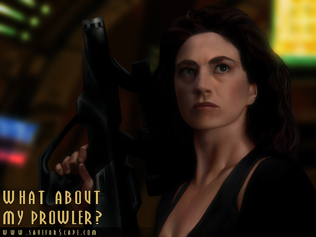
Farscape - Aeryn *UPDATED*
By
herr-o
Watch
Published:
Jan 15, 2004
32
Favourites
16
Comments
15K
Views
Description
I’m not entirely happy with it.
My excuse... Women are much harder to draw.
hehe
[update]
I've reworked the face, and fixed the lighting on her hair... I like it a bit better now
[/update]
Image size
1024x768px 157.63 KB
© 2004 - 2024
herr-o
Comments
16
Join the community
to add your comment. Already a deviant?
Log In
Vierna-Drottingu
Dec 16, 2009
I totally agree with you that women are much harder to draw... anyway, great job on Aeryn
Reply
Load more
")
 (Smile)")